
Report Builder
design for complex data
Overview
Flexible Reporting was one of the top requested features through product-market-fit survey for MachineMetrics products. The primary aim was to revamp the current production report page to create a one-stop-shop for generating different types of reports, as opposed to several isolated pages for each report. The new report page needed to be highly customizable to meet the unique needs of customers.
The following are the goals that were established:
Develop a central report page that could produce individual reports in one location, without the need for separate pages.
Redesign controls and filters for complex table of data with adaptable functionality.
Introduce new features that enable flexible selection and grouping based on different user permission levels.
Add date picker, quick links to specific date/time, that also works with the concept of actual versus contextual time range.
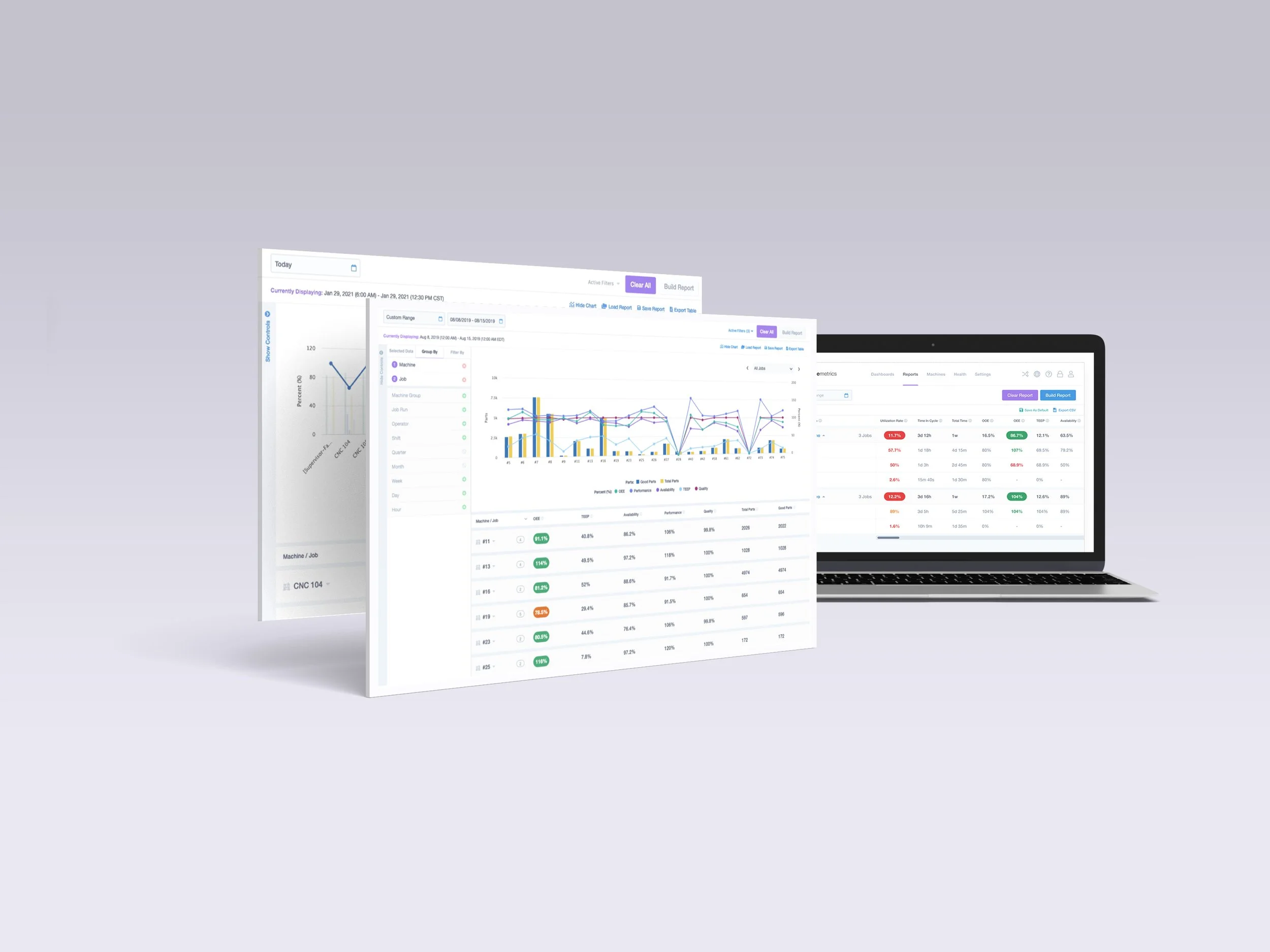
Redesign complex charts and data visualization to enhance clarity and ease of understanding.
The previous report system required users to access separate pages for each individual report. This meant that there was no easy way to view and compare multiple reports side by side or export them to a single file. Below are examples of the former individual report pages:

Where we started: our focus was on exploring and evaluating the production report builder, as it had more complex filtering options.

Initial Iterations
As we began to dive deeper into the production report builder, we recognized the need to rethink the information architecture, main call to actions, and table of data. During the exploration of filtering and user flow on the page, I arrived at a solution for organizing all the page elements in a manner that was both meaningful and functional, while also catering to user needs on mobile or tablet screens. Additionally, I began to incorporate the machine icon that I previously designed for this project.


Final Iterations
To optimize screen space, I implemented a sidebar with expanding/collapsing functionality and used it to categorize the controls section. Red, Green, and Orange (as in-fault, good, and warning) represent a particular status of a machine or a data item in MM app.
I created a fully functional interactive prototype in Figma, which was used in user testing sessions with MM customers. Based on the feedback we received, I incorporated constructive changes into the design to improve its usability and effectiveness.


Controls
This section is divided into three tabs which gives the users more power and flexibility to build a wide range of reports.

Save Report
During usability testing and speaking with customers we learned the possibility to save a report would provide high value and it can also save a considerable amount of time for users.


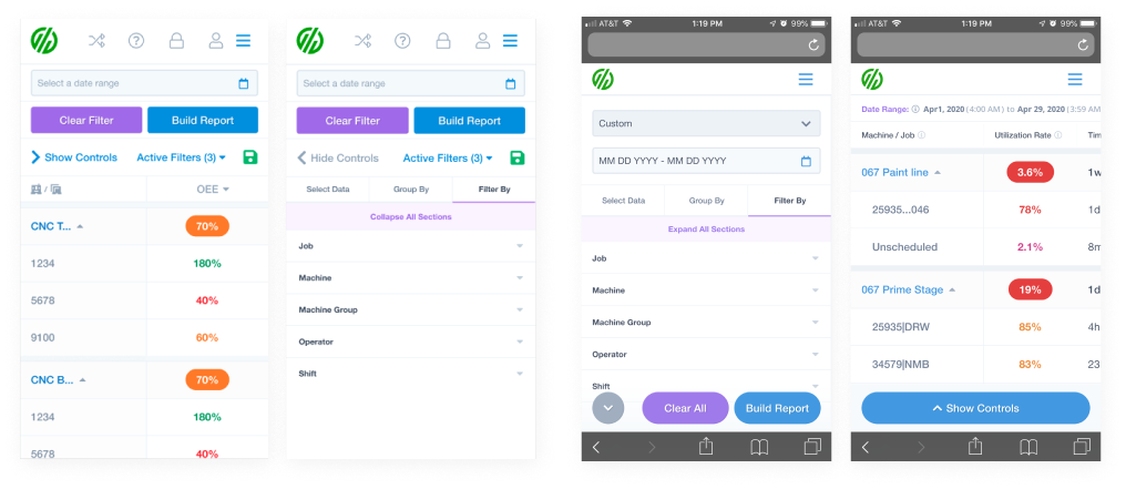
Responsive Design
As part of my effort to design for touch screens, such as tablets and mobile devices, I initially explored the use of slide in/out controls. We opted to display only one column for the selected data at a time. However, after further exploration and testing, I decided to revise the comps and incorporate horizontal scrolling for easier reading of the data in the table. I also placed the CTAs (call to actions) at the bottom of the screen for better accessibility on touch screens.
Charts
In addition to the goals previously mentioned, we also aimed to include the ability to present data in the form of charts on the main report pages. However, there were several factors that needed to be considered in the first iteration of the chart design. This was a crucial step in our effort to sunset all individual reports and rebuild them in a single page. Below are the table for categorizing data items based on individual reports and their units, and my initial exploration around adding charts to report page.

In order to ensure accessibility and visual distinctiveness, I compiled a list of 12 colors that met these criteria within the given constraints.

How it is going…
It's clear that this was an ongoing project, and the goal was to continually improve the user experience of the report page and make it more intuitive for customers. This was a collaborative effort across cross-functional teams, and everyone involved did a great job in building the page. Moving forward, the plan is to add charts to the exporting feature and create a more robust flow for exporting reports. This will ensure that customers have an even better experience with the product and can easily share and use the data presented in the reports.
