
Problem Space
WebAR is Not easy to learn
“I’ve got 10+ years of development experience; took me 3 months to learn
8th Wall.” -Evan
“I was surprised when I find playground projects.” -Casey
Unclear guidance on where to start
or find help
It takes avg of ~5 days for a new user to start a new project!
It takes almost 30 steps to finish sign up process for 8th Wall!
“The first day was utter confusion until I saw templates.” -Neil
What features our developers value the most?
Limited user insight and assumptions about key features made it hard to identify the most impactful direction.
Objectives
Accelerate user activation, retention, and time-to-value by reducing friction, delivering contextual guidance, and enabling users to launch successful commercial projects faster.
Discovery
To define the right solution, I partnered with Product and Engineering to analyze support requests, conduct user interviews, and run a MaxDiff survey. These insights helped prioritize high-impact features that aligned with our activation, retention, and business goals.
Part One: Project Creation
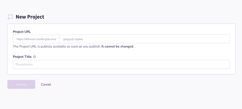
I redesigned the project creation flow by simplifying workspace selection and introducing clearer decision logic for project creation, duplication, and hosting configuration. The updated flow reduces cognitive load, improves scalability for multi-workspace users, and ensures system behavior is transparent and predictable across different user contexts.


The Evolution



Part Two: Legacy Project Library & Template Picker
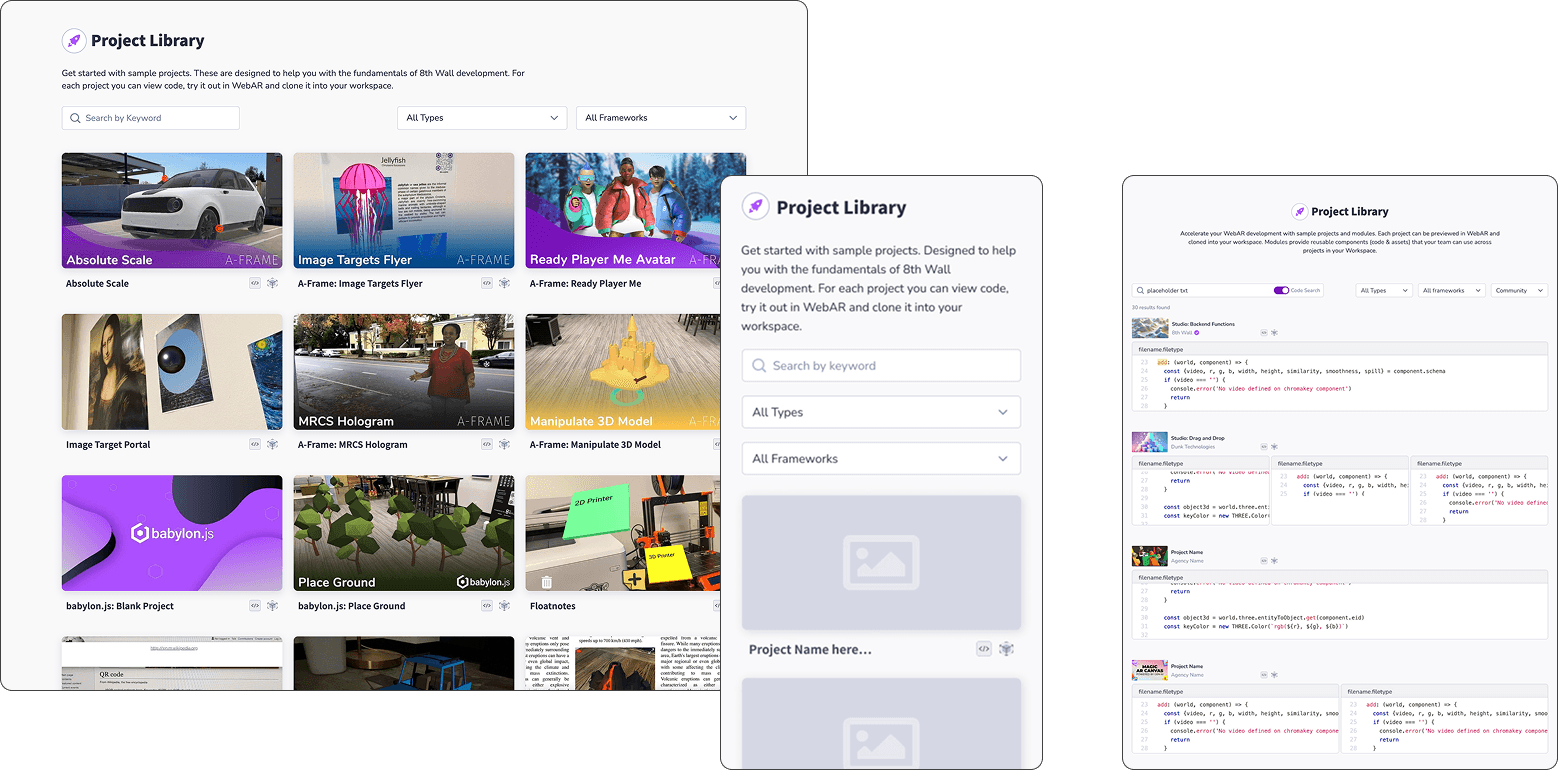
Before users could start building in 8th Wall, they first had to create a project, open the editor, and clone a repository. Finding the right starting point, however, was unnecessarily difficult. The Project Library and Template Picker contained much of the same content but weren't connected, and there were no search, filters, categories, or tags to help users discover relevant templates. With little guidance and inconsistent documentation, users often had to clone projects or dig through READMEs just to understand what a template was for, creating friction before development even began.

After exploring the existing information architecture, layouts, and platform constraints, I designed the foundational UI for the new Template Picker. This design established a reusable pattern that later became the basis for similar experiences across the platform. Since there was no shared UI library at the time, I documented component sizes, spacing, and interaction states in detail. These annotations also served as a practical onboarding resource, helping engineers become familiar with Figma while ensuring consistent implementation.

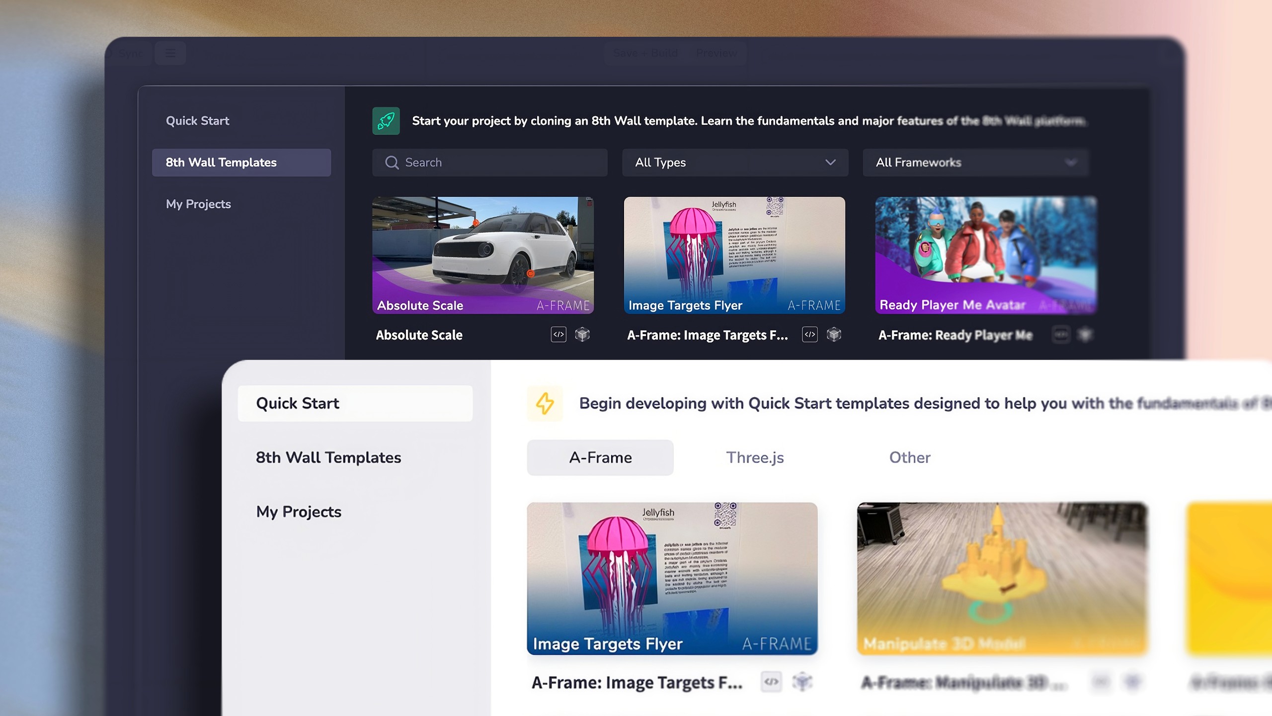
The redesigned Template Picker introduced a new sidebar with dedicated Quick Start, searchable templates, framework filters, and a detailed template page with breadcrumbs. The layout and interaction patterns established here later became a foundation for similar UIs across the product.

Part Three: FTUE, Warm Welcome
The first-time user experience evolved through several iterations. Initially, new users were left to navigate the platform on their own with little guidance. We introduced a Warm Welcome experience that surfaced starter projects and helpful resources directly on the home page, making it easier to get started.
As the product matured, we experimented with interactive Pendo walkthroughs to guide users through key workflows. While useful for orientation, they didn't always help users achieve meaningful progress.
The final direction shifted toward a more practical, hands-on onboarding experience. Instead of explaining the interface, users were guided through building a real project step by step, helping them reach their first successful outcome faster and increasing time-to-value.

